


How to Present a Brand Identity to a Client
You finished the brand identity. The logo looks good, the colors and type all make sense together. Everything's solid in your design file. Now comes the part that a lot of designers underestimate: actually presenting it.
This isn't about making fancy slides. It's about the gap between a client who sees a logo on a white artboard and a client who sees their brand on a storefront, a business card, and a website header in the same deck. Same design, completely different reaction. The presentation made that difference.
This guide covers how to set up a brand presentation that does your work justice. What to show, in what order, how to frame it, and how to handle the feedback conversation that follows.
1. Start with the Why, Not the Logo
It's tempting to open with the main event. You've been staring at this logo for days, you're happy with it, you want to show it off. We totally get that! But it actually helps to spend two or three slides on context first. Remind the client what you were solving for. The audience, the positioning, the general direction you agreed on during the strategy phase.
This does something useful: it puts the client in the right frame of mind before they see the design. Instead of reacting with pure gut feeling, they're thinking about the goals. It's a small setup that makes the rest of the conversation smoother. The logo is too bold or not bold enough, maybe their partner prefers green - those kinds of detours still happen, but they're easier to navigate when the brief is fresh in everyone's head.
Keep it short. Two slides, maybe three. You're not re-doing the strategy deck, just warming up the room.
2. Build the Story in Layers
Once the context is set, think about the order in which you reveal the work. You're not showing a folder of files. You're walking the client through a sequence, from the thinking to the design living in the real world.
An order that works for most identity projects:
Context first. The brief, the audience, the core idea. We just covered this.
Design direction. Moodboards, references, the visual territory you were working in. This is a nice bridge between strategy and the finished identity. It lets the client see where the design came from, which helps it feel less random and more intentional.
The core identity. Logo, color palette, typography. Give each element some room. Don't squeeze the logo, three color variations, and the type scale into one layout. Separate slides and let each piece land.
The system in action. Stationery, social templates, signage, UI elements. This is where the identity starts to feel like a real system instead of just a logo. Clients usually get more engaged here because things start to feel tangible.
The brand in context. Mockups and real-world applications. This is usually the most exciting part of the deck for the client, because it's the first time they see their brand looking like something that actually exists. More on this below.

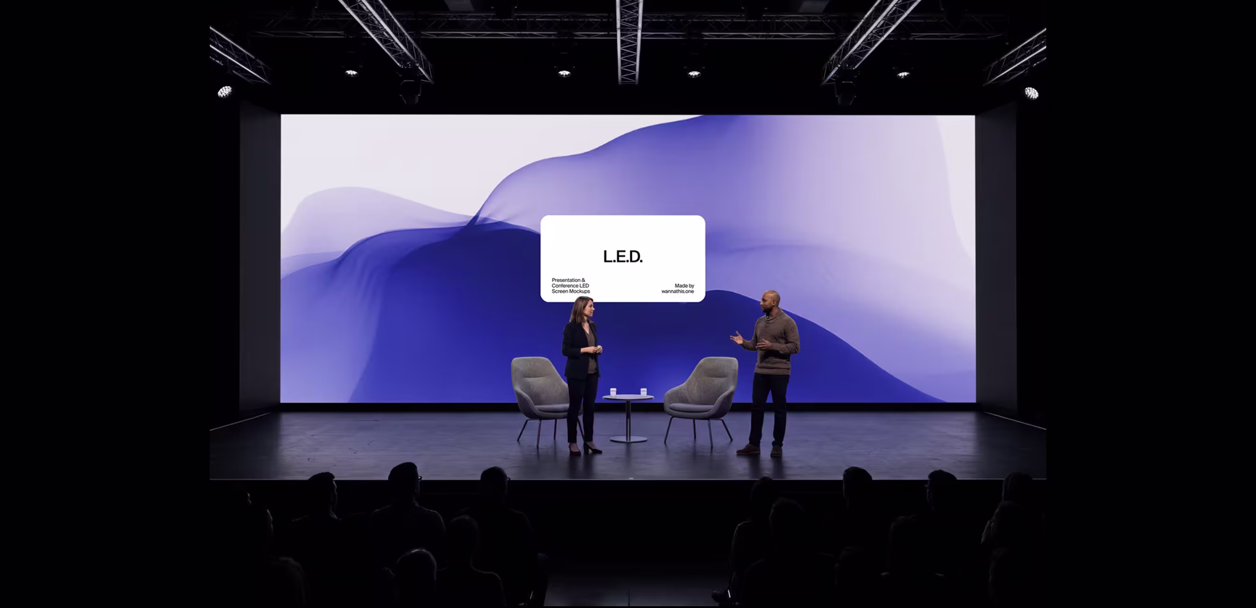
3. Show the Work in Context
A designer shows a logo on a white background, the client is uncertain. Same designer puts that logo on a glass office door, a tote bag, a website with real content, and the client gets it immediately. The design didn't change. The context did.
Mockups in a brand presentation aren't decoration. They're doing real work. They bridge the gap between a design file and the thing the client is actually trying to build, which is a business that looks and feels a certain way.
A few things worth thinking about when putting this section together:
Match the scene to the brand. If you're presenting a law firm identity, don't stick the business card on a bright pink surface next to a potted cactus. The mockup should feel like the world this brand belongs in. Professional brands get clean, minimal scenes. Creative brands get something with more texture and energy. It sounds obvious, but it's easy to grab whatever looks good without checking whether it fits.
Show enough touchpoints. Business cards are obvious, but also think about signage, packaging, screens, social media, maybe apparel. Three or four applications are usually enough to show range without the deck getting repetitive.
Quality makes a difference here. A well-shot mockup with good lighting and real textures makes the brand look considered and polished. Generic or flat-looking scenes don't add much. We wrote about why mockup quality actually affects how clients perceive your work, and it applies here more than anywhere.
Five or six good slides is plenty. You don't need to mock up every possible application. A few strong ones that cover different formats are more effective than a long scroll of similar-looking scenes. You want each image to have a moment.

4. Pick the Right Format
This depends on the client, the budget, and how much trust you've already built.
A PDF deck is the most common. The client can open it on their own time, forward it to their team, sit with it for a day before responding. The thing to keep in mind is that you won't be there to explain anything, so the slides need to hold up on their own.
A live walkthrough over a call or in person is great for the first round. You can pace the reveal, explain your thinking, and respond to questions in real time. It's usually worth sending the deck as a follow-up afterward so the client has something to reference.
A Figma file works well with design-savvy clients or people you've already worked with. It's fast and collaborative. For a first brand presentation, a polished deck tends to feel more appropriate, but it depends on the relationship.
For most projects, the best combo is a live walkthrough plus a PDF they can keep.

5. How You Talk About the Work
The deck is one half of it. The other half is how you walk the client through what they're looking at. A few things we've found helpful over the years:
Tie decisions to the brief. When you explain a choice by tying it back to the audience or the positioning, it sounds like a strategic decision. When the explanation is just about aesthetics, it sounds more like a preference. Clients respond better to the first one.
Use plain language. Design terminology is great when you're talking to other designers. With clients, it's better to describe what the design does in practical terms. Why the typography works for their audience, why the layout is structured a certain way, what the color palette communicates. Same ideas, just phrased so they land.
Be clear about what's flexible. Separate the foundation from the details. The logo and core palette are the things that hold the system together. The supporting elements, patterns, secondary colors, illustration style, those are usually where there's room to explore. Saying this out loud gives the client a way to engage without pulling apart the whole thing.
Present with conviction. It helps to go into the presentation feeling solid about everything you're showing. If something still feels unresolved, it's usually better to leave it out and present what you're genuinely happy with. You set the energy for how the work is received.

6. After the Last Slide
When the slides are done, it helps to guide the conversation a bit rather than just asking "so what do you think?" Open questions like that tend to get vague answers. It's more productive to walk through the key elements and ask about them specifically. How does the logo feel in context? Does the color palette fit the direction we discussed? That way the feedback is structured and easier to work with later.
If the client needs time, that's a good sign, not a bad one. Send them the deck and give them a day or two. Feedback that comes after someone has sat with the work is usually more focused than whatever they say in the first five minutes.
One thing that saves a lot of back and forth: when the feedback does come in, summarize it into clear next steps before jumping into revisions. A quick message with "here's what we'll adjust based on your notes" makes sure you're aligned and keeps the project moving.

7. A Few Things Worth Keeping in Mind
Sure, presenting brand identity to clients is something everyone figures out through trial and error, that's just how it goes. But there are a couple of things that can make the process easier from the start:
Keep the options focused. Two directions is a good number. Three if they're really different concepts. More than that and the client starts mixing pieces from different options, which usually leads somewhere nobody intended.
The context slides are worth it. Those two minutes at the beginning help keep feedback connected to the brief, which makes the whole conversation easier. Build up to the applications. If the brand is already on a tote bag before the client has processed the logo, there's too much happening at once. Letting the core identity land first works better.
Invest a bit in mockup quality. A generic mockup with flat lighting doesn't add much to the presentation. If you want something with better art direction, here's our roundup of premium mockup studios that we've found useful.
Leave some space between slides. If every slide is packed with content, the client doesn't really have room to react. A pause after the logo reveal, a moment after the mockups section. People form opinions in those quiet moments, and it's good to give them that.
Wrap-Up
Presenting a brand identity is its own thing, separate from designing one. A good presentation doesn't need to be complicated. It just needs to give the work enough room to be understood.
Start with the brief. Build toward the visuals in layers. Show the brand in real-world settings. Explain your thinking in plain language. And leave space for the client to take it in.
That's really most of it. The design does most of the talking. The presentation just gives it the right stage. And if you're looking for mockups to help with your next brand presentation, feel free to browse our mockup catalog.
Recent articles

How to Present Your Designs Like a Pro: Tips For Designer

Why Subscription Models Work Better Than Buying Individual Assets


