Best Device in Hand Mockups to Elevate Your App Presentation
There’s something different about seeing an app on a real screen, in someone’s hand. A flat screenshot can look clean, but it often feels like it’s floating in space. Put the same design inside a device mockup - held naturally, in the middle of everyday life - and suddenly it clicks. That’s when your app feels less like an idea and more like something people can actually use.
So we’ve pulled together a set of mockups that do just that: phones and tablets in real hands, in real contexts, ready to bring your app presentations to life.
1. iPad Desk Scrolling Mockup

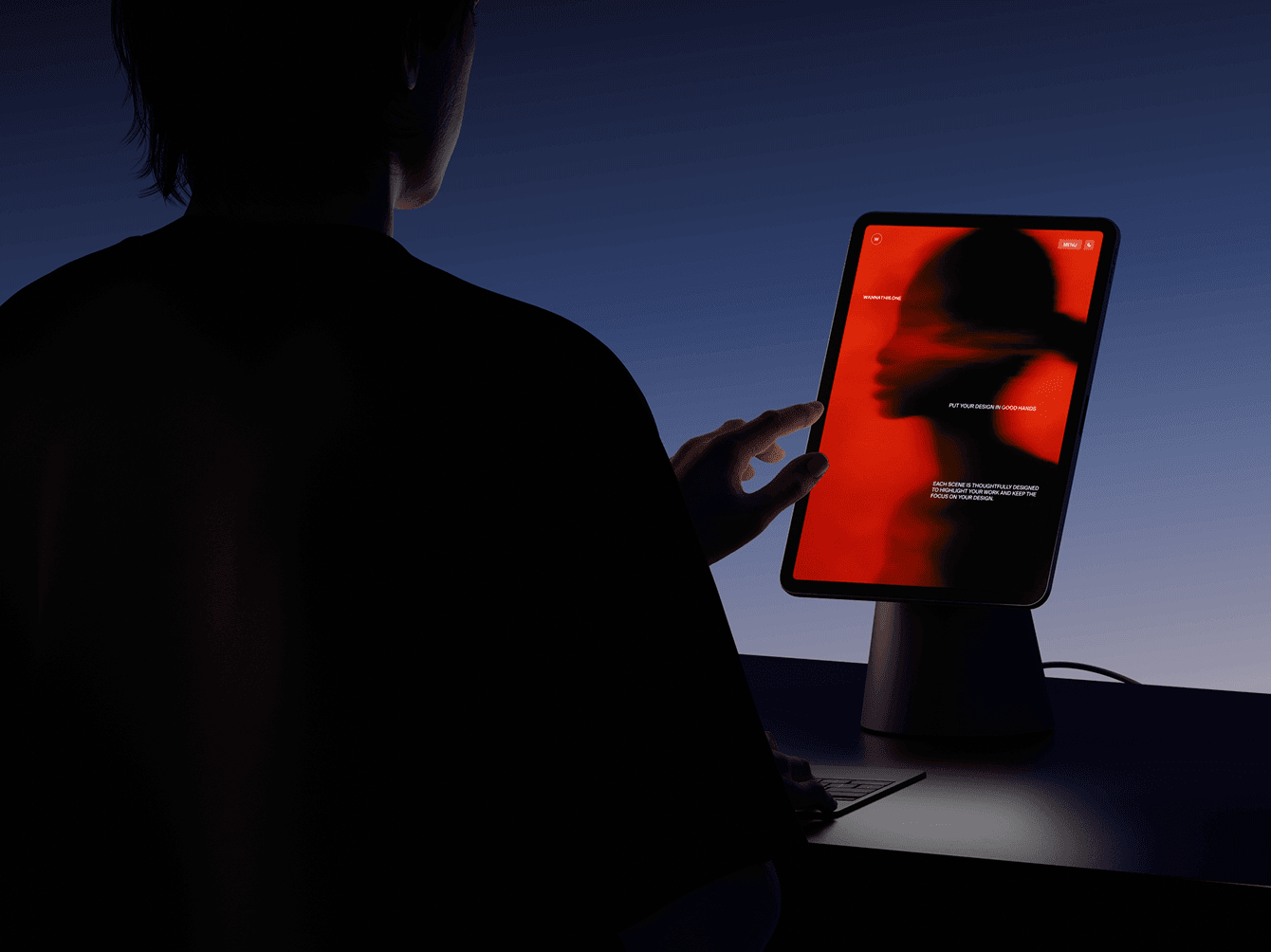
First up, a mockup from our own studio, Wannathis. It has a bit of a cinematic vibe with just enough contrast. The scene feels natural and calm, almost like catching someone mid-scroll at their desk. It’s simple, relatable, and lets the app design take center stage without overcomplicating the scene.
The full collection includes 36 mockups, with both vertical and horizontal formats, plus a mix of close-up and wider shots. You can also adjust the background - go for a dark, light, or colorful theme depending on the story you want to tell. It’s a flexible set that makes showing off your app feel polished.
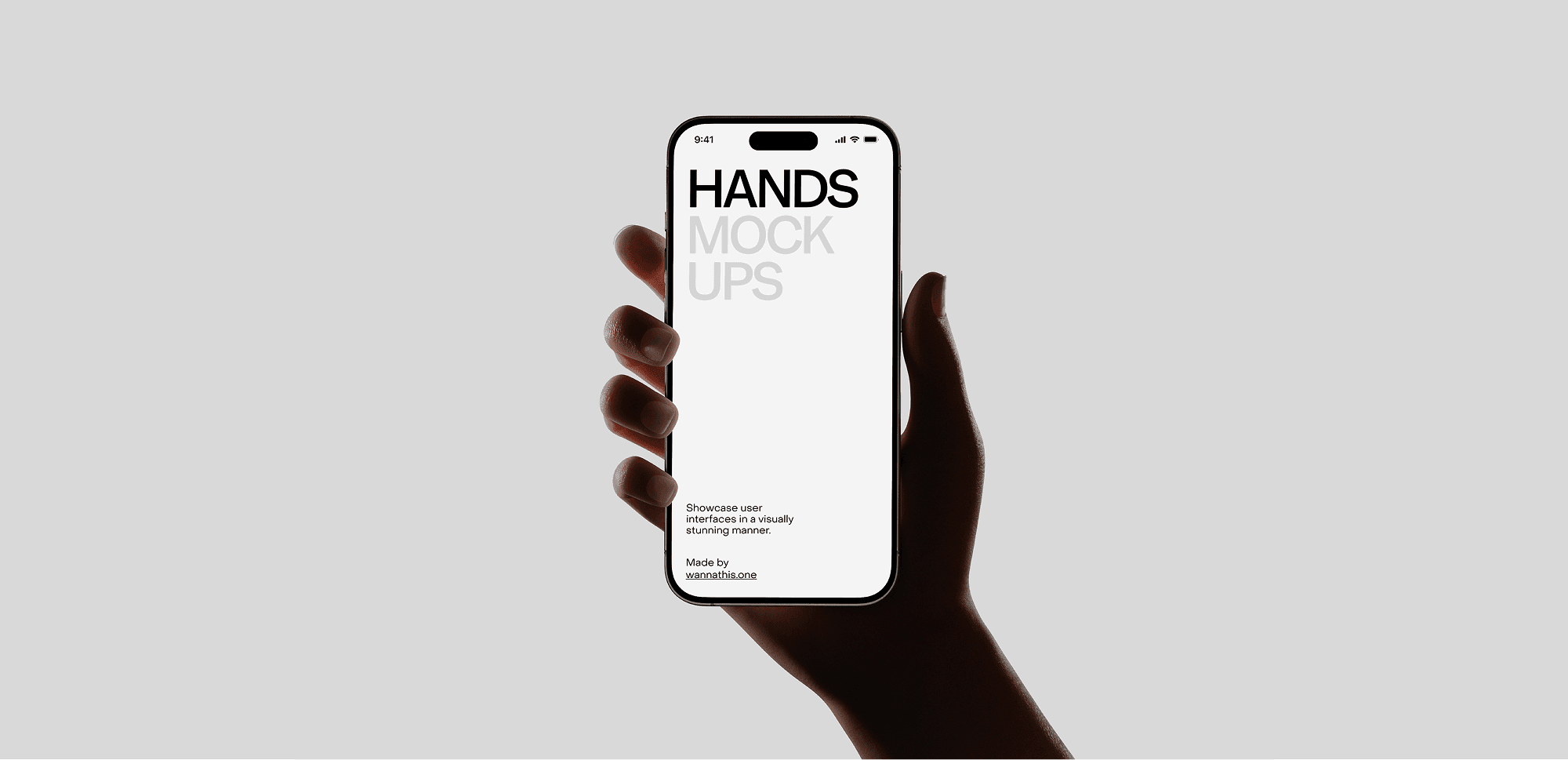
2. Minimal iPhone in Hands Mockup

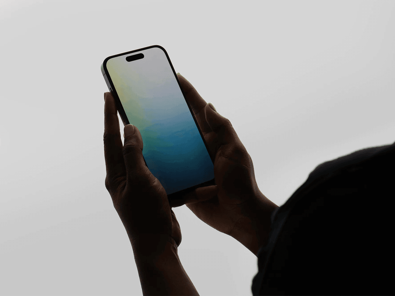
This one keeps it super simple: a phone held in both hands against a plain gray background. No props, no extra mood - just a clean frame where your app takes all the attention. Works well if you’re after something minimal without distractions.
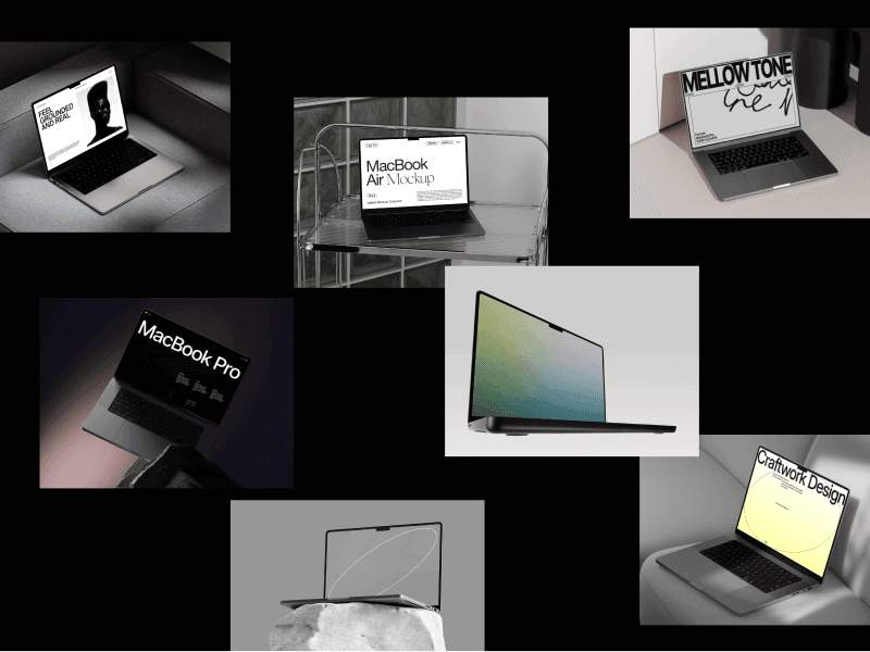
3. MacBook in Use Mockup

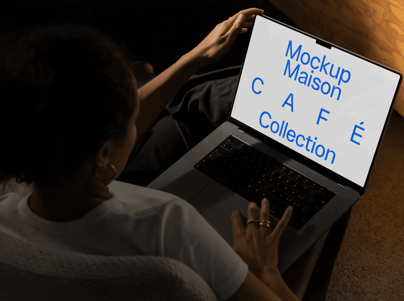
Here we’ve got a more cozy setup - a laptop resting on someone’s knees, with the screen tilted toward the viewer. It feels like a casual moment of browsing or working from the couch. A handy option if you want your design to look natural in a relaxed everyday scene.
4. iPad Neutral Background Mockup

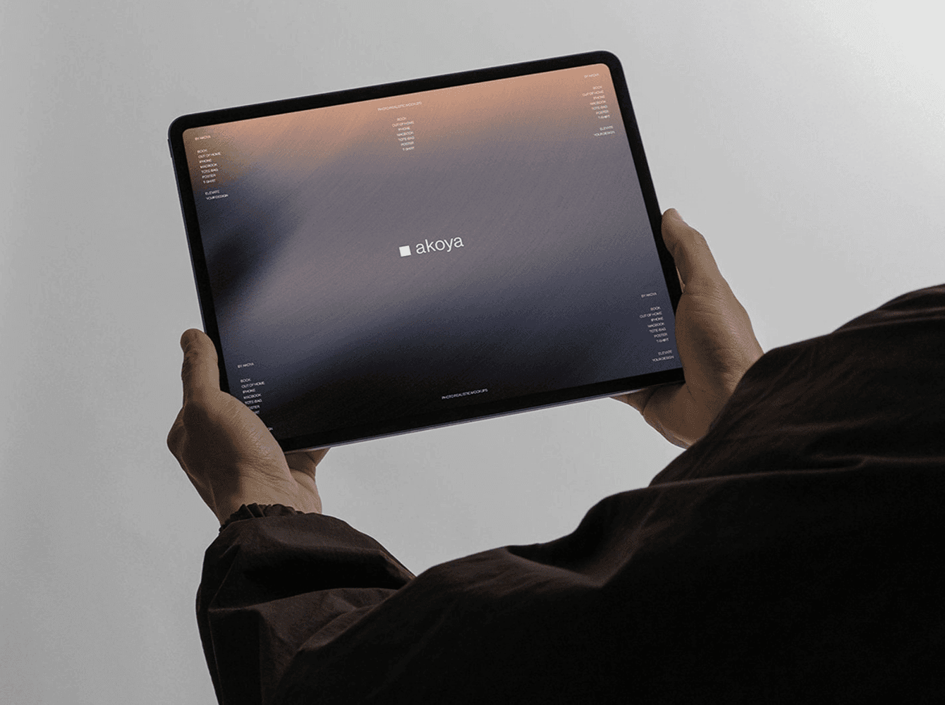
A straightforward shot of an iPad held with both hands. The neutral backdrop keeps the focus on the screen, and the framing gives plenty of space for your design to show. It’s a simple way to present an app or layout in a horizontal format.
5. MacBook on Table Mockup

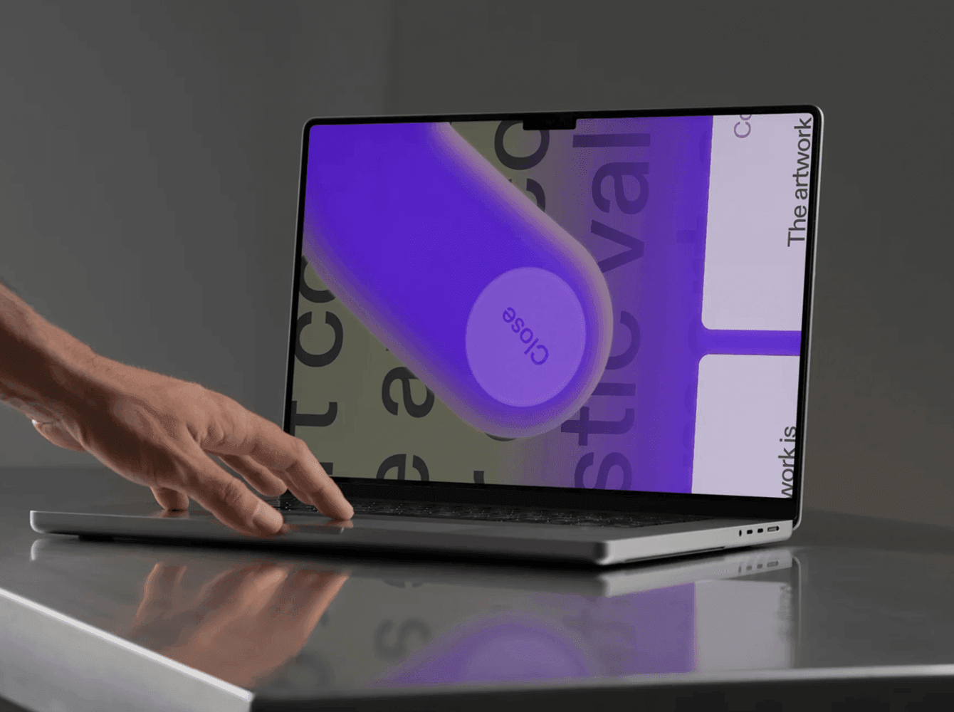
This one feels a bit more polished: a laptop on a sleek table surface, hand reaching in as if about to type. The reflections on the desk add a touch of realism, but the overall scene stays clean and professional. Great for app dashboards or web layouts.
6. iPhone Tapping Gesture Mockup

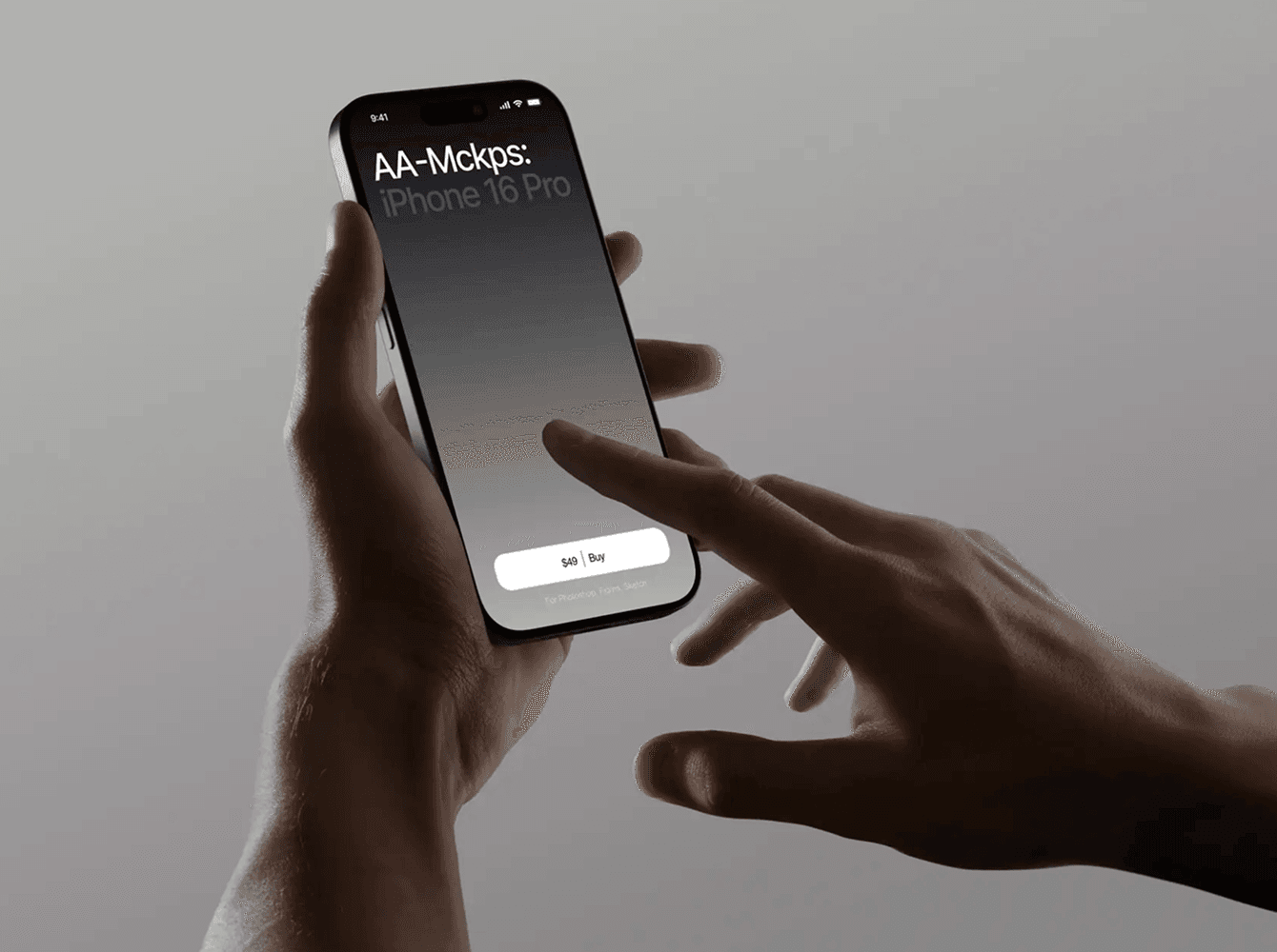
A closer view of the phone, with a second hand about to tap the screen. The plain background makes it easy to drop in any design, while the gesture adds a sense of interaction. It gives your mockup a little more “in use” feeling compared to static shots.
7. iPad Seated Scrolling Mockup


Another take with a tablet, this time more relaxed - someone holding it while seated. The angle feels natural and the larger screen space makes it suitable for magazine-style layouts or prototypes.
8. iPhone in Hand Light Mockup


Here’s another mockup from Wannathis, shown in one hand with a clean, light background. It has that crisp, polished look where the screen immediately feels like the main character. The hand is lit in a natural way, so it feels balanced and grounded, and the whole setup is bright and open, giving your design space to breathe.
The set also gives you variety: three different color schemes, adjustable background colors, and plenty of scenes to choose from. It’s flexible and easy to adapt, which makes showing your app feel smooth and professional without overthinking it.
9. MacBook with Coffee Cup Mockup

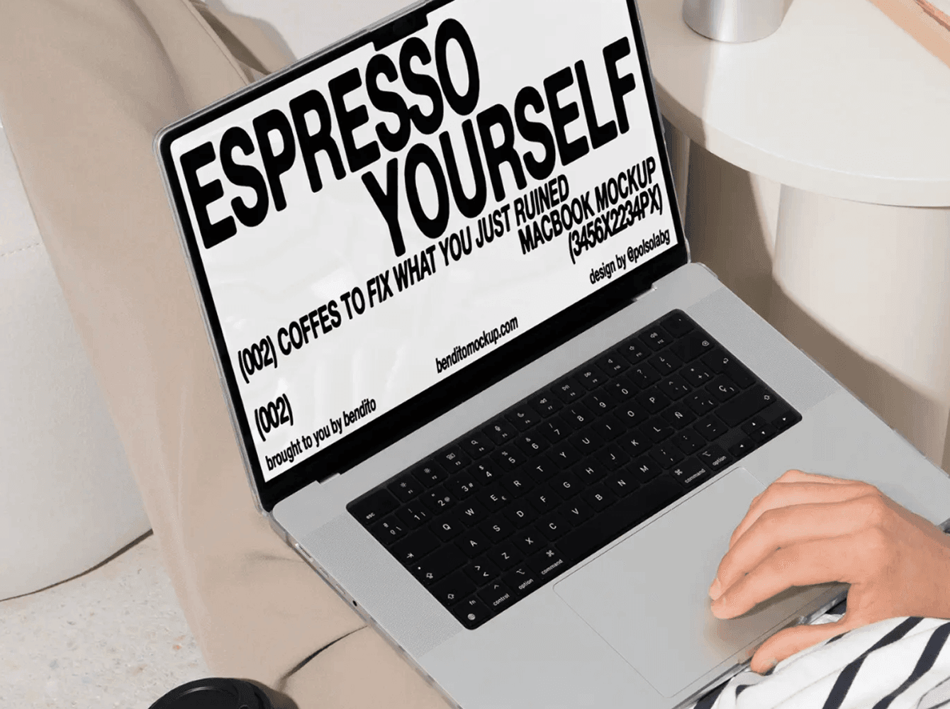
Instead of a polished desk scene, this one feels more like a break in the day - laptop balanced on the lap, coffee in hand, and a casual work-from-anywhere vibe. It’s easy to picture yourself in that moment, which makes the design on screen come across as approachable and real.
10. iPad in Hands Table Mockup

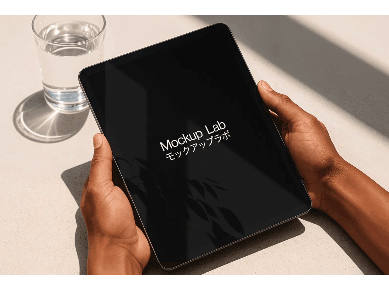
An iPad held with both hands on a sunlit table - simple and grounded. The glass of water and soft shadows add a bit of everyday texture, making the scene feel natural without pulling focus from the screen. It’s the kind of setup that works well if you want to show your app in a calm, realistic environment.
Wrap-Up
Looking through these mockups, you can see how different moods change the way a design feels - from minimal gray backgrounds to everyday coffee breaks, or bold, contrast-heavy setups. Each one tells a slightly different story, and that’s what makes them useful: you can pick the scene that feels closest to how you imagine your app being used.
If you’d like to see more, check out our full library of mockups at Wannathis - from iPhones and iPads to MacBooks and beyond.


