Web Design Trends 2026
Web design in 2026 is shaping up to be a year of experimentation. New digital tools are opening doors that used to require whole teams, and now a single designer can create things that would have felt impossible just a few years ago. With all this new freedom, people are trying bolder ideas, mixing mediums and pushing interfaces into playful, unexpected directions.
At the same time, there is a growing desire to keep a human touch in the work. As technology becomes more powerful, designers are finding ways to bring warmth back into visuals through color, texture or small imperfections that make a layout feel alive.
It is an interesting mix: a year driven by new possibilities, but also grounded in the need for personality. 2026 looks like a moment where old and new meet, where experimentation becomes the norm and where web design feels more human than it has in a long time.
1. WebGL & Interactive 3D
Gamification is quietly weaving itself into every corner of digital design, and the web is no exception. Tools like Spline made it surprisingly easy for a single designer to build a tiny world right inside the browser. A page can now react, shift, unfold or guide you through space in a way that feels playful rather than technical.
This trend is not about replacing flat design. It is about adding another layer when the story calls for it. Instead of simply visiting a website, the user gets a small experience. A moment of exploration. A sense that the interface has depth and personality. And because these tools are no longer reserved for dev teams, more designers will experiment with them in 2026.
2. Adaptive Microinteractions
Microinteractions live on a small, very personal layer of design. They can be as simple as a soft click or a gentle nudge when you press a button, but today they go far beyond classic UI feedback. Many websites now play with reactions that follow your movement. Airborne Studio is a great example: instead of waiting for you to click something, the interface comes alive around the cursor with playful visuals. It gives you the sense that the page is paying attention to you, not the other way around.
While WebGL plays with exploration and world-building, microinteractions shape the daily dialogue of the UI. They make the experience smoother, more intuitive and a little more human.
3. AI Hyper Minimalism
It is hard to talk about 2026 web design without mentioning AI. It is everywhere. Chat-based interfaces are becoming part of site navigation, and AI-powered tools make it possible to build things in hours that once required full teams. But there is another side of the story that deserves attention.
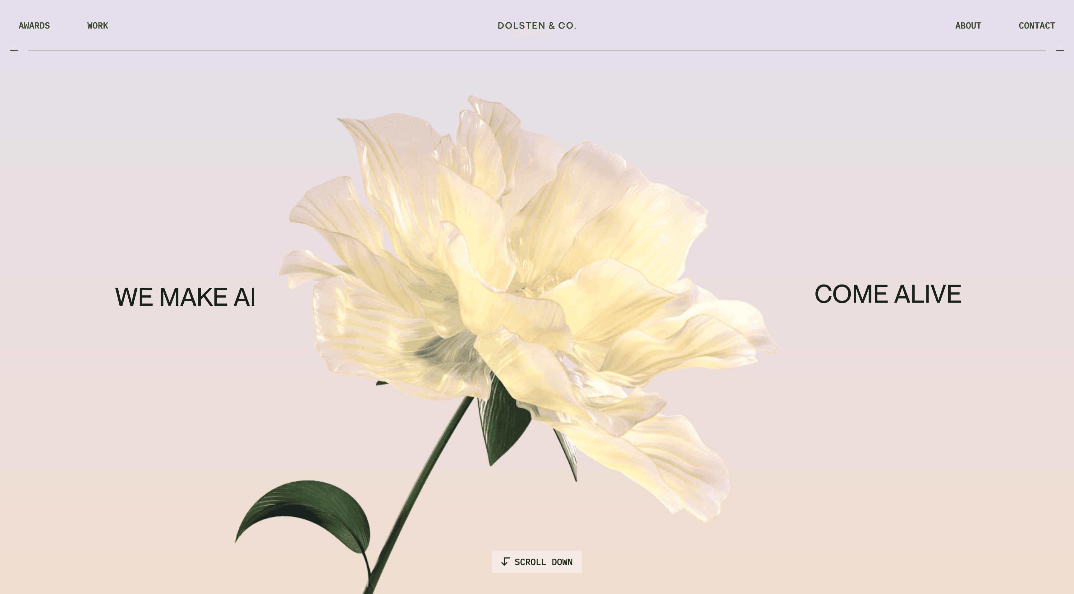
AI platforms themselves are shaping a new aesthetic. Think of OpenAI, ElevenLabs, Midjourney and others. Their websites feel almost futuristic but strangely calm. Clean layouts, soft gradients, lots of breathing space, simple shapes and just enough motion to feel modern without being loud. This stripped-back, hyperminimal look has become a trend of its own. It carries that feeling of a quiet future, where everything is smooth, fast and effortless.
4. Maximalism
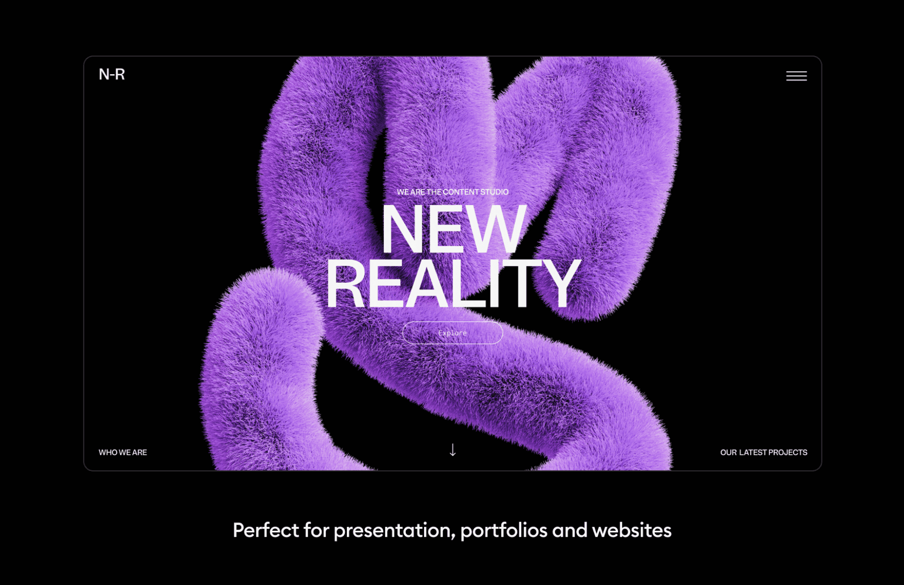
While AI hyperminimalism pushes everything toward simplicity, maximalism runs in the other direction with a huge grin. Oversized type, layered visuals, rich color palettes, textures that overlap in playful ways - it all comes together to create a bold, expressive world.
Maximalism is not about making things chaotic. It is about embracing personality. Big typography that greets you instantly, colors that feel full of energy, compositions that stack and stretch just enough to feel interesting but not overwhelming. It brings drama, fun and a strong visual pulse that stands out in a feed full of quiet minimal interfaces.
5. Experimental Navigation
One of the biggest shifts this year is how designers approach navigation. Instead of sticking to predictable menu bars and strict grids, more sites are experimenting with layouts that invite exploration.
It feels less like following instructions and more like discovering a space. You scroll, things unfold, layers reveal themselves, and you start to feel like part of the journey.
This adds a surprising amount of emotional connection. Browsing becomes an experience, not a checklist. And in a world full of templated layouts, this sense of curiosity makes a site so much more memorable.
6. Anti-Design
Anti-design has become a major movement across graphic design, and it makes perfect sense why. It resonates with a very human need for imperfection. Instead of polished symmetry and neat grids, this trend leans into controlled chaos: unusual proportions, unexpected spacing and visual rhythms that feel slightly off in a deliberate way.
At first glance it may look unstructured, but the magic is in how intentional it actually is. Raw textures, unpolished shapes and broken grid lines create a sense of honesty, as if a real person left their fingerprints on the work. These small mistakes are not mistakes at all. They add character, warmth and a feeling that the design wasn’t manufactured by a machine but shaped by someone with an opinion.
7. Tactile Forms and Textures
Textures are making a big comeback in web design. Designers use scanned paper, chalky brushes, grain, fabric patterns and organic shapes to bring warmth back to digital spaces. These tactile elements give the screen a physical feeling, even though everything is still pixels.
This trend works because it balances the futuristic direction of modern web tools with something grounded and emotional. A little grain or a soft, uneven shape can completely change the warmth of a layout.
8. Early Internet Nostalgia
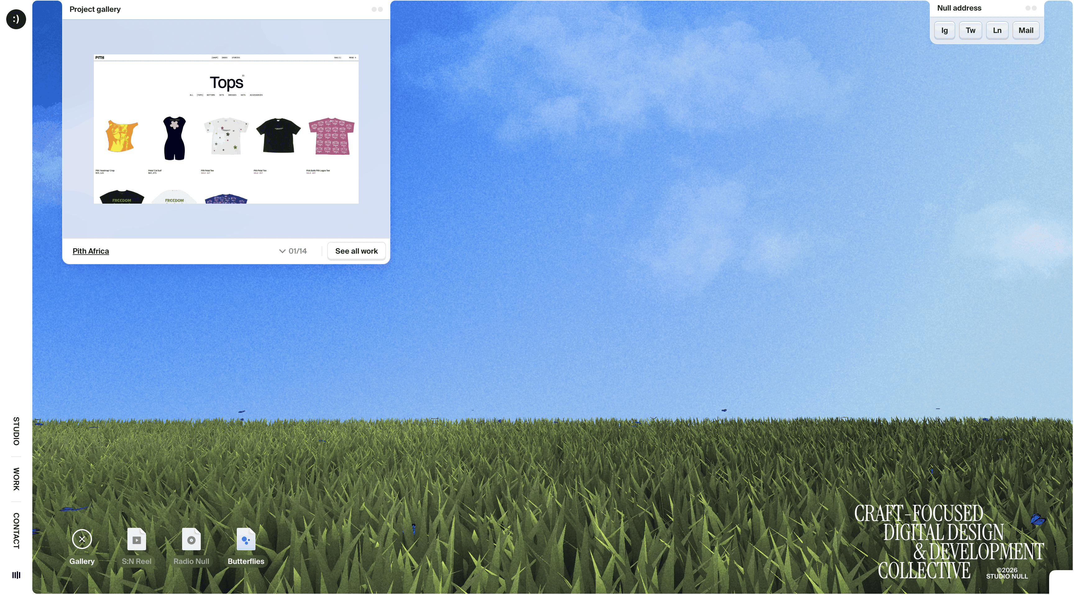
Nostalgia never really leaves design. It just keeps changing shape. Right now we’re seeing a softer version of early-internet aesthetics return: desktop core, rounded glossy UI elements, airy blue–green gradients, little hints of Frutiger Aero, brushed-metal textures and subtle Y2K accents. It feels warm and slightly retro, but not like a direct revival of 2000s web design.
Instead, these references show up in calmer, more modern ways. The layouts are cleaner, the rhythm is easier on the eyes and the overall vibe feels intentionally soft. It’s early internet energy, but filtered through today’s taste - familiar enough to trigger memories, updated enough to feel relevant.
9. Gen Z Design
Gen Z design deserves its own category because it operates with a different emotional engine. For this generation, feeling sits at the heart of visual language. You see it instantly: mood comes first, structure comes second. Pages greet you with personality before they explain anything.
It’s also a remix culture. Gen Z pulls from everywhere at once - Y2K gloss, early-internet pixels, bright dopamine colors, playful typography, metal-inspired surfaces, chunky gradients. It’s messy in a good way, expressive, emotional and totally unafraid to mix aesthetics that traditionally never lived together.
This approach makes Gen Z design feel alive. It isn’t about choosing one style. It’s about creating a vibe that hits on first glance and stays with you because of how it feels, not because it follows any particular rulebook.
10. Sound on
Sound is slowly becoming another sense in web design. It can be as small as a soft click when you press a button or a gentle tone that follows a simple action, or it can turn into a full background soundtrack that shapes the mood of a page. Some projects even take it further. Media Engineering, for example, has an entire page dedicated purely to listening, which turns sound into its own little experience.
By adding audio, websites start to feel more three-dimensional. You don’t just see the interface, you hear it respond. It is a small detail, but it makes interactions feel fuller, warmer and a lot more engaging.
11. Virtual Reality Websites
We’re not living fully in VR yet, but the web is starting to flirt with it. More sites are building small spatial experiences: 360-degree rooms, immersive product views, softly animated digital spaces you can almost step into.
It’s less about constructing entire virtual worlds and more about adding dimension where it actually improves the experience. It’s a glimpse at where the web is heading - toward interfaces that feel like places, not just pages.
Wrap-Up
Web design in 2026 feels expressive, curious and full of experiments. Designers are blending new digital capabilities with a desire to keep the work warm and human. Colors are louder, layouts are looser, interactions are friendlier and visuals feel more alive.
If the last era was about perfection, this one is about personality. A reminder that design is not just a tool but a way of creating small experiences people can feel.
And if you want to see how design is evolving beyond the web, from color to typography and the visual moods shaping this year, you can also check out our article on Graphic Design Trends 2026. It’s an easy way to get a feel for where creative work is heading right now.


