


Best bento grid examples
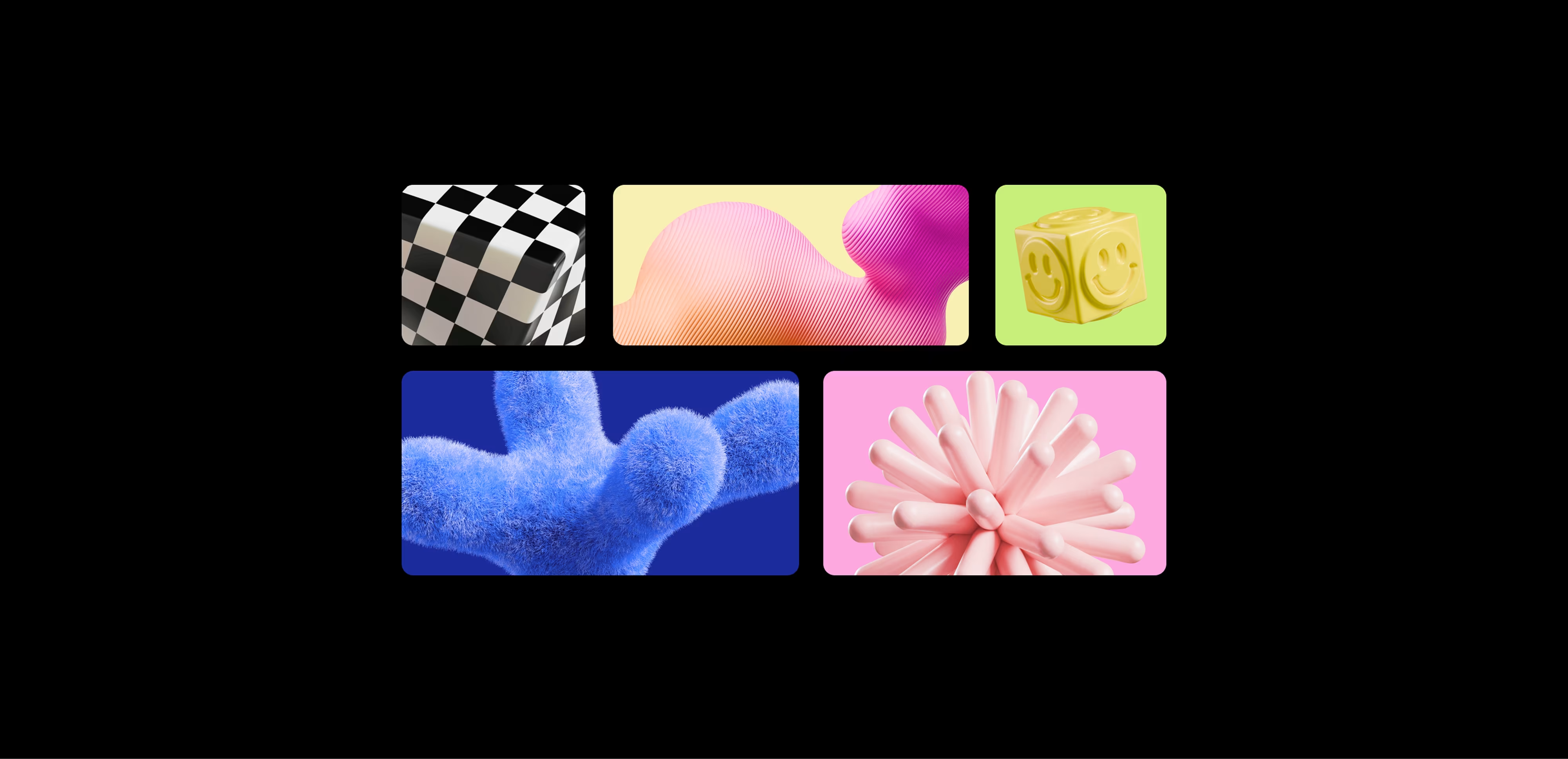
You've definitely seen a bento grid, even if nobody told you that's what it was called. It's that layout made of tiles of different sizes, all snug together in a grid, each one holding a single idea. The name comes from the Japanese bento box, where every compartment has its own thing and the whole arrangement just feels satisfying to look at.
Designers love it for good reason. It takes a pile of features or products or ideas and makes them feel calm and organized instead of overwhelming. And it photographs beautifully, which is half the reason it took over brand identities, product pages, and social feeds in the last couple of years.
A quick bit of history before the examples. Apple's keynote slides and product pages helped kick off the craze, and software brands ran with it until it became the modern default. Since then it's jumped way past tech into branding, packaging, and social content, which is where it gets really fun. Here are nine examples worth learning from, and what you can actually take from each.
1. Bolt


Koto's rebrand of Bolt, the one-click checkout platform, is a brilliant example of a bento used for brand storytelling rather than a product page. The identity is loud in the best way, built on a bright "lightning yellow" palette and a custom typeface, all laid out in a grid of tiles that mixes logos, product shots, type, and little moments of the brand.
What to steal here is energy. The grid keeps a busy, high-voltage identity from feeling chaotic. Every tile is a different piece of the brand, but the structure holds it all together so it reads as confident instead of cluttered.
2. Whatsapp

Another Koto project, and a completely different mood. Their WhatsApp work, built around the idea of Forward Together, uses bento-style layouts to show how one design system stretches across product and marketing. Green, clean, and friendly, with tiles that feel calm and human.
This one's worth studying if you're presenting a design system or a big brand refresh. The grid becomes a really clear way to show a lot of pieces, from icons to messaging to ad layouts, without the deck turning into an endless scroll. It's a great reminder that bento works as a storytelling tool, not just a webpage layout.
3. Bento Grid Templates

If the first two feel like big-budget studio work, this one's for the rest of us. Dirtybarn put together a set of six bento grid layouts made for social posts, and they're fully editable in Illustrator, so you can drop in your own content and go. It's a lovely shortcut if you want the look without building the grid from scratch.
Handy to keep bookmarked whenever you need a quick, on-trend social template. It also shows how well bento translates from big websites down to a single square post, which is exactly where a lot of us actually work day to day.
4. Starface

Starface, the Gen-Z pimple-patch brand, is proof that bento doesn't have to be sleek and minimal. Their product pages are bright, maximalist, and packed with personality, using a grid of playful tiles to mix product shots, star motifs, reviews, and bold color. It feels more like a fashion brand than a skincare one, which is entirely the point.
The takeaway is that the grid is just a container, and you get to decide the vibe. Starface fills every tile with character and fun, and the bento structure is what keeps all that maximalism from tipping into a mess. Perfect inspiration if your brand has a loud personality.
5. Gumroad

Gumroad rounds things out with a bento that's colorful, chunky, and a little rebellious. Bright blocks and a layout that feels energetic rather than corporate. It sits somewhere between the studio polish of Koto and the playful maximalism of Starface.
If your brand has personality but you still want things to feel structured, this is your reference. The grid gives you the order, and you're free to fill it with as much color and character as you like.
6. The Craftsmen

The Craftsmen, by Kaploom Creative House, is an Awwwards Site of the Day built on a bold blue-and-yellow palette. It uses bento-style tiles to break a single-page agency site into clear, playful blocks, so the whole thing feels lively without losing its structure.
Good reference if you're building an agency or studio site and want it to feel confident and colorful. It's a nice example of bento carrying a strong visual identity rather than just organizing features.
7. LottieFiles

LottieFiles is the go-to platform for lightweight animations, and fittingly, its site uses bento tiles that actually move. Little animated previews live inside the grid, which is exactly the kind of subtle motion that keeps a bento feeling alive instead of static.
Worth studying if you want to add animation to your own grid. It shows how a tile with a small looping animation can pull attention without being distracting, which is the balance most animated bentos are trying to strike.
8. IT human resources platform

Most of the examples so far are marketing pages, but this Dribbble concept from Awsmd shows bento working inside an actual product interface. It's an HR and IT platform dashboard where the grid organizes stats, people, tasks, and quick actions into tidy modules you can scan in a second.
Really useful if you design apps and dashboards rather than landing pages. It's a good reminder that bento isn't just a way to sell a product, it's a genuinely practical way to lay out a busy interface without it feeling cluttered.
9. Framer

Framer uses bento tiles across its own design pages to show off what the tool can do, which is a fitting choice given how easy it makes building grids like these. Feature tiles, product shots, and little interactive moments all sit together in a layout that feels modern without trying too hard.
There's a nice bonus here too. Framer has bento components and generators built right in, so if a grid like this is what you're after, it's also one of the quickest ways to actually build one yourself.
Wrap-Up
The thing all these examples have in common is that the grid is never really the point. It's just a calm, flexible container, and the personality comes from what you pour into it. Koto fills it with brand energy, Starface fills it with color and fun, a dashboard fills it with data, and a portfolio fills it with a life. That's why the bento format has stuck around, it bends to whatever you're making instead of forcing a single look.
So if you're reaching for a bento in 2026, spend less time worrying about the grid and more on what goes in each tile. And a lot of those tiles will be product or device shots. Flat screenshots sitting in a nice grid still look flat. Drop those same screens into a clean phone or laptop mockup, and suddenly the whole layout feels finished and real.
That's the bit we work on. We make mockups over at Wannathis, for phones, laptops, and branding things like business cards and tote bags. So next time you're filling those tiles, have a dig through our mockup catalog and grab whatever fits.
Recent articles

AI and Design: Tools That Actually Help Creatives

Best Interior Device Mockups for Designers. From iPhones to MacBooks


