Top Typography Trends 2026 for Designers
Typography is shifting fast. Every year, new tools, new screens, and new aesthetics shape how we read and feel design - and 2026 already looks bold, animated, and a little experimental. Fonts aren’t just fonts anymore; they’re becoming characters in their own right.
We’re seeing designers treat type as more than communication - it’s atmosphere, rhythm, and identity. From kinetic and 3D typography to expressive color and handcrafted forms, this year is all about type that moves, glows, and feels alive. So here’s a look at the trends that are shaping how typography will look and feel in 2026.
1. Kinetic Typography
Static words are starting to move. Kinetic typography turns simple text into a storytelling tool - animating letters to follow rhythm, sound, or even a scroll. We’re seeing it everywhere: landing pages, product teasers, music videos, and even UI transitions.
The magic of kinetic type is that it makes even a minimalist design feel alive. Whether it’s subtle breathing motion or a full word stretch across the screen, motion helps typography speak in new ways.
2. Bold & Expressive Fonts
Oversized, unapologetic typography continues to lead in 2026, but it’s no longer just about being loud. Designers are using bold fonts to express tone and personality, pairing them with contrasting weights or playful kerning to add rhythm.
This year, we’ll see type that feels sculptural and emotional - like it has a voice of its own.
3. Distorted & Experimental Type
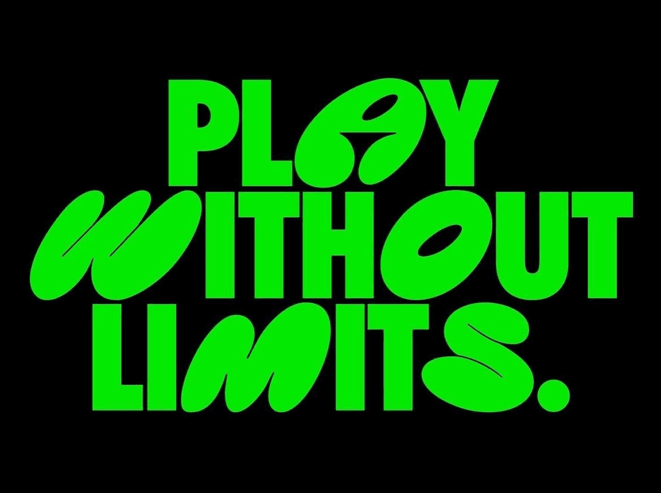
Forget symmetry. Typography is bending, stretching, and warping in unexpected directions. Designers are breaking structure - making type elastic, twisted, or even partially hidden - to capture movement and curiosity.
It’s part of a bigger aesthetic shift toward soft brutalism: still minimal, but rough around the edges. Think raw textures, asymmetry, imperfect grids, and organic motion - the “human” side of digital design.
You’ll spot this trend in editorial layouts, portfolio sites, and promo visuals that feel more handmade than algorithmic.
4. 3D Typography
Text is turning into texture - words pop out of the screen, catching light, creating depth. 3D lettering is everywhere: campaign visuals, AR interfaces, and motion posters.
We’ve also been playing with this idea at Wannathis, where our 3D letters pack gives designers ready-made type elements that add that tactile, dimensional feel.
It’s the perfect way to bring a futuristic yet playful tone into a clean digital setup, especially when paired with smooth animations or bold minimal backgrounds.
5. The Rise of Soft Brutalism
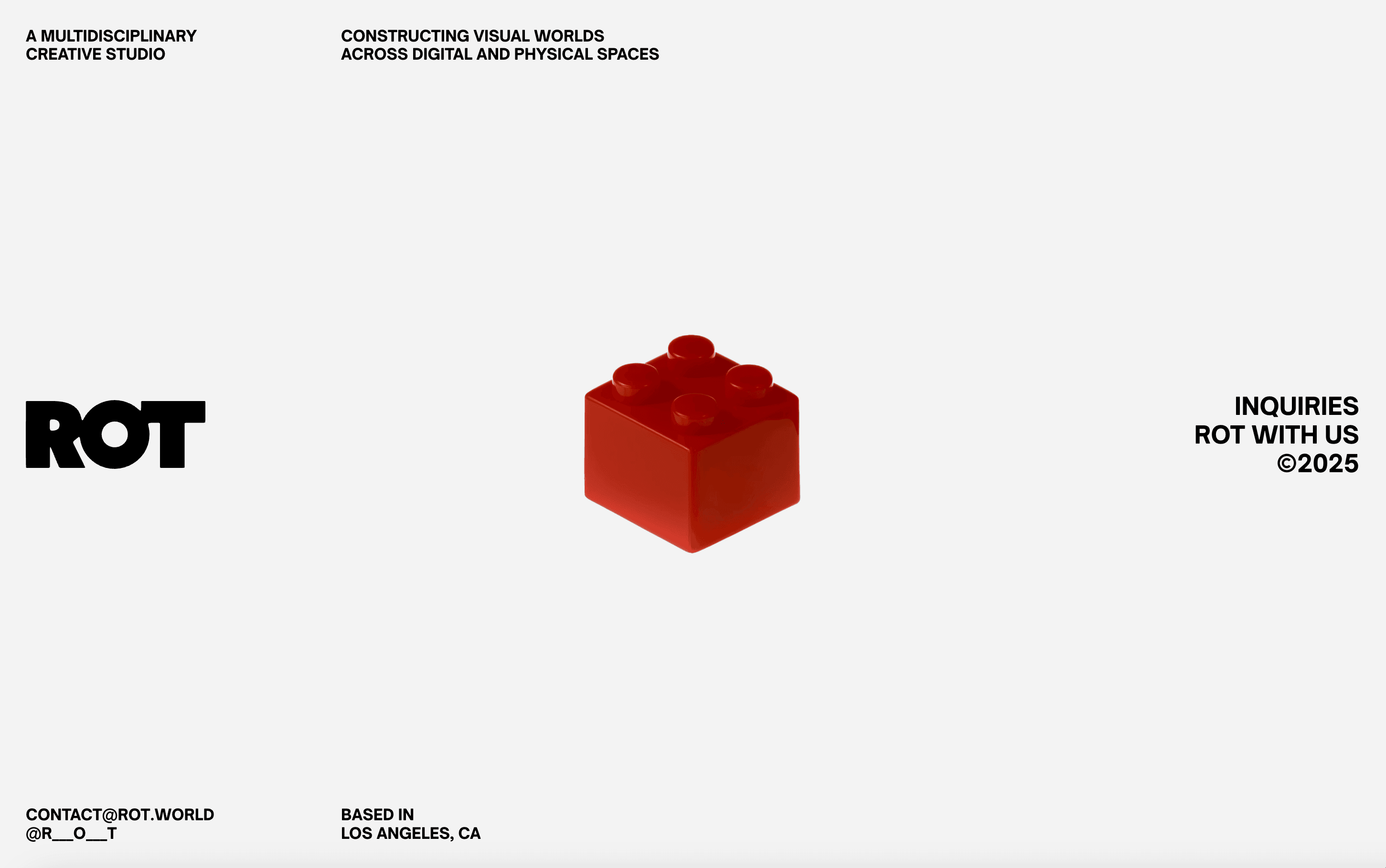
Soft brutalism isn’t going anywhere - it’s just evolving. The heavy, blocky type of the past few years is being refined with smoother edges, pastel backgrounds, and friendlier motion. It’s brutalism with empathy.
Designers are mixing bold typography with muted tones and rounded forms, creating something that feels confident but human. This hybrid look dominates product sites, creative agencies, and minimalist portfolios in 2026.
6. Retro Typography Comeback
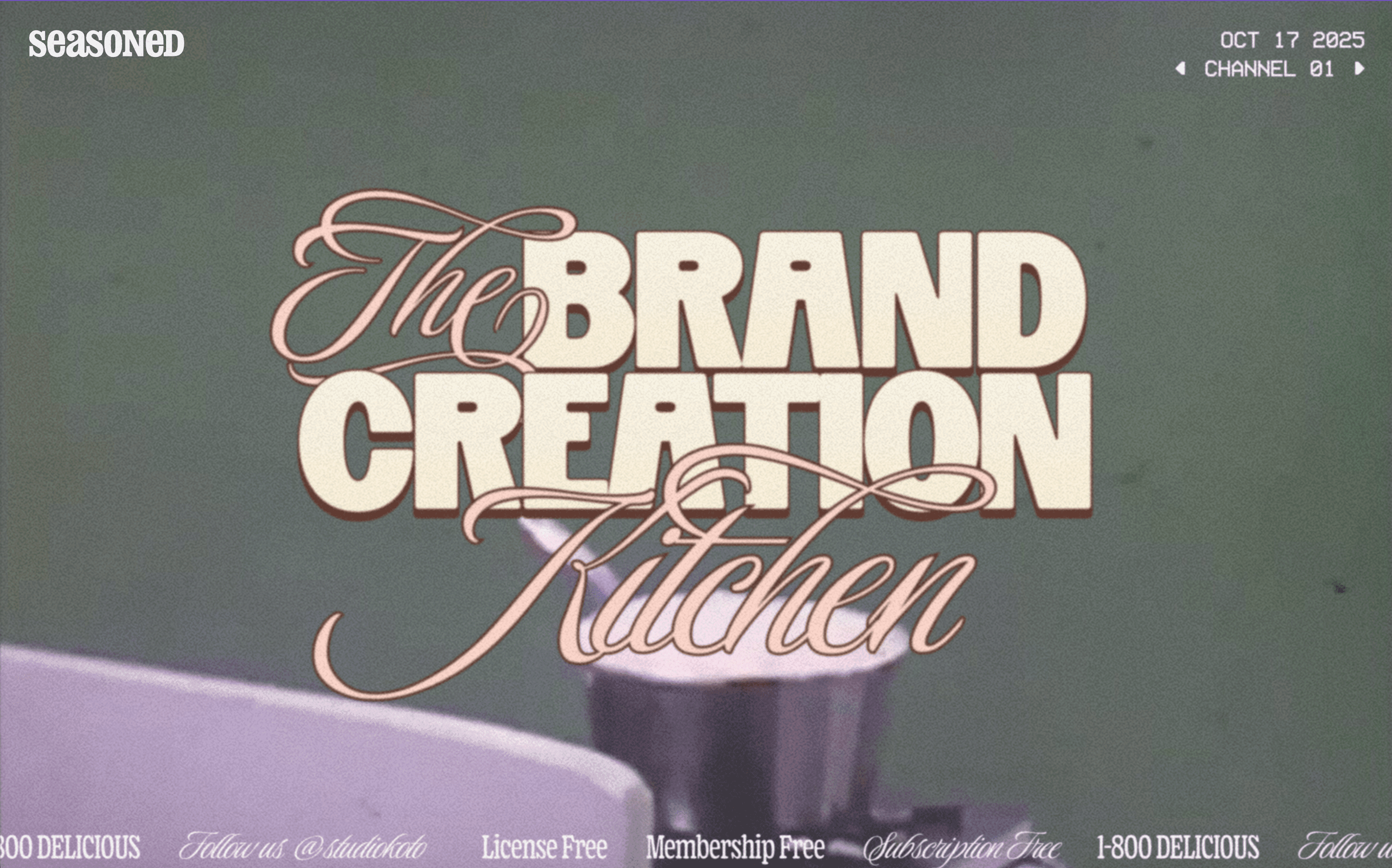
Nostalgia meets fresh edge in 2026. Expect a resurgence of retro-inspired type - bold slab serifs, funky ‘70s curves, playful vintage scripts, but reimagined for modern layouts. Mix them with rough textures, uneven baselines to keep them feeling alive.
These styles work especially well in branding, posters, and editorial layouts where character matters as much as readability.
7. Handcrafted Fonts
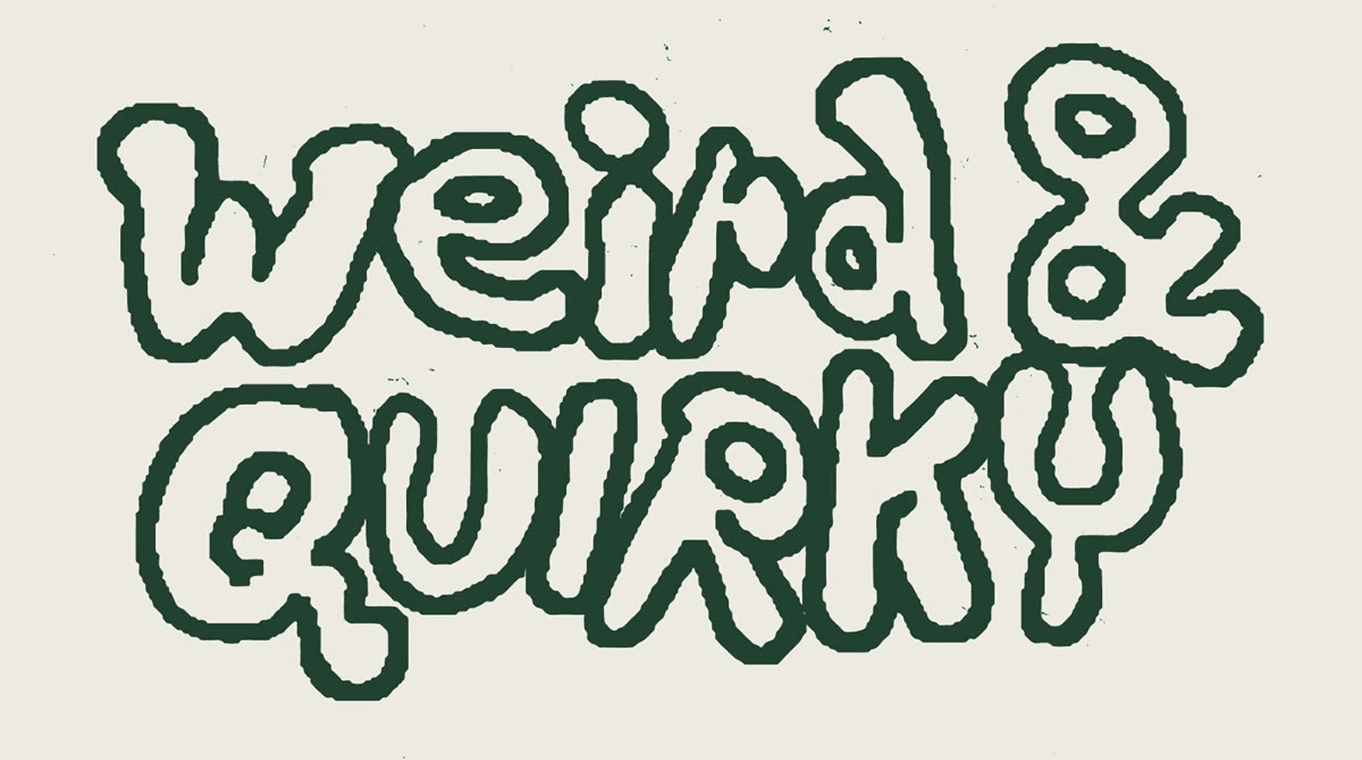
In a world of pixel-perfect perfection and ai-generated fonts, the human touch is refreshing. Handcrafted typefaces, with uneven edges, brushy strokes, or visible texture, are back in demand.
They bring warmth, authenticity, and a personal vibe to digital work. Expect to see them in branding, packaging, and even app design - anywhere a brand wants to feel approachable and human.
8. Vibrant Color Typography
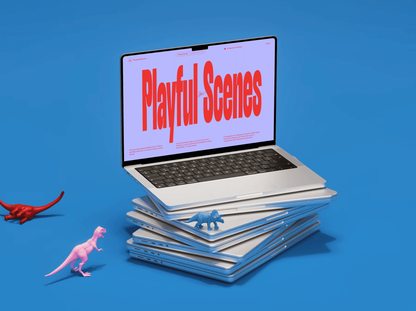
Type isn’t just black and white anymore. Designers are going all-in on color - think electric blues, zesty oranges, neon greens, and deep magentas. These vibrant palettes make text impossible to ignore and add warmth, emotion, and rhythm to even simple layouts.
Paired with soft gradients or minimal backgrounds, it keeps things energetic without overwhelming the design. This trend reflects how typography is becoming as expressive in hue as it is in form.
Wrap-Up
Typography in 2026 feels fresh and full of energy. It’s less about precision and more about expression - type that reacts, moves, and connects.
The rules are loosening, the colors are brighter, and the letters themselves are becoming part of the story. Design is shifting from being read to being felt, and typography is leading that change.
At Wannathis, we actually talked about this shift in a recent article on UI design trends for 2026 - how design in general is becoming more emotional, adaptive, and alive. Typography is just one of the ways we see that change happening in real time.


