Top UI Design Trends for 2026 You Can’t Ignore
Every year, UI design shifts just enough to make last year’s work feel a little dated. 2026 is shaping up to be no different. From color choices to the way screens move, small details will set the tone for what feels fresh - and what feels stuck in 2025.
We’ve pulled together top UI design trends that stand out right now. Think of this less as a “rulebook” and more like a snapshot of where design is heading - a mix of what people actually enjoy using and what designers are experimenting with today.
1. AI as a design partner
Let’s start with the big one - the shift that’s already changing how design looks today and will keep shaping how it feels in the future. Designers are still the ones setting the vision, but AI has stepped in as a kind of assistant, making the process faster and smoother.
Instead of trying to “replace” designers, AI handles the basics - first layouts, quick color directions, or simple component sets. That foundation saves time, so you can focus on the details and creative choices that actually make the work yours. It’s why interfaces in 2026 already feel a bit different: they’re shaped by human intent, but boosted by a responsive helper in the background.
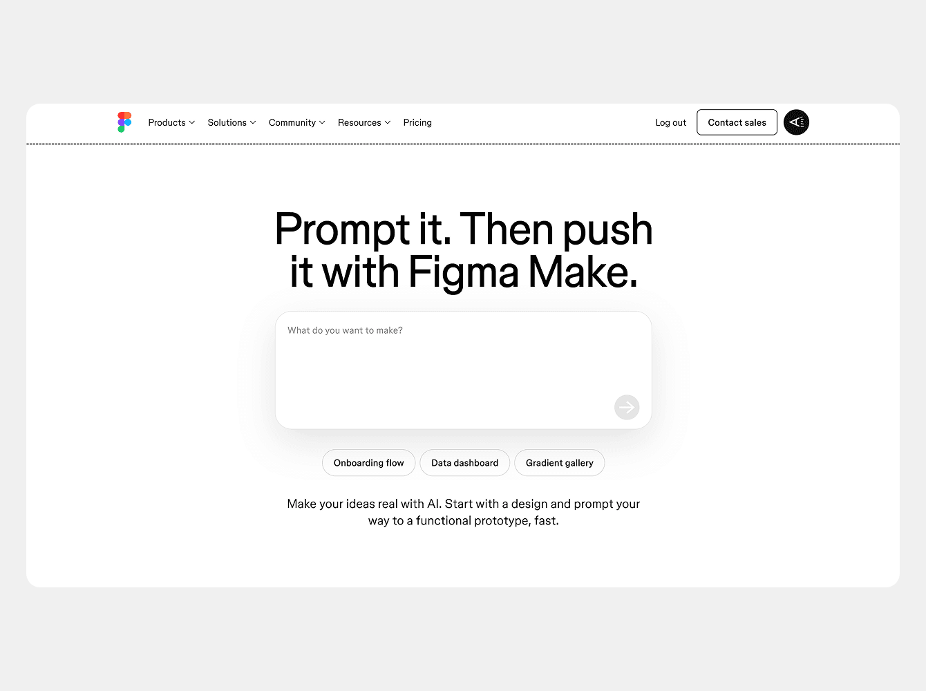
Tools like Figma Make show how this works in practice: you type a prompt, and AI instantly generates a working design you can refine further.
We talked more about how AI is changing the way designers work in this article, where we reflect on its impact on the creative process.
2. Storytelling through scrolling
Scrolling used to be purely functional: move down the page, see more stuff. But now it’s becoming an actual storytelling tool. With layered animations and smooth transitions, each swipe feels like a chapter in a story.
It’s almost like directing a movie scene. Instead of dumping all the information at once, they reveal it in steps, guiding your eye naturally. In 2026, we’ll see more interfaces that feel like small journeys rather than static screens.
3. 3D depth in UI
Flat design isn’t going anywhere, but it’s starting to get layered again. Shadows, textures, and subtle 3D details are showing up more often, giving screens a sense of depth and making elements feel closer to touch.
It’s not about flashy effects - more like gentle layers that add presence. A button that feels raised, a card that casts a soft shadow, or an image that seems to pop just a little. These small touches make interfaces feel more tactile and engaging without overcomplicating the design.
4. Motion Micro-Interactions
Tiny movements can make a big difference. A slight bounce, a smooth fade, or a quick shift when something updates - these little touches make a UI feel alive and responsive without adding noise.
In 2026, motion design is becoming quieter but smarter. It’s less about showy animations and more about giving the interface a sense of rhythm - the kind that makes using it feel effortless and natural.
5. Digital Nostalgia Reimagined
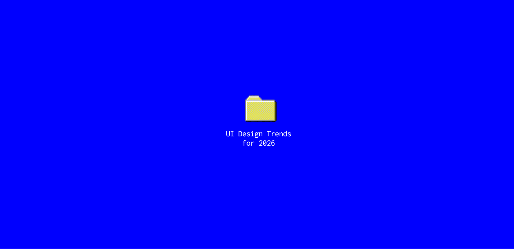
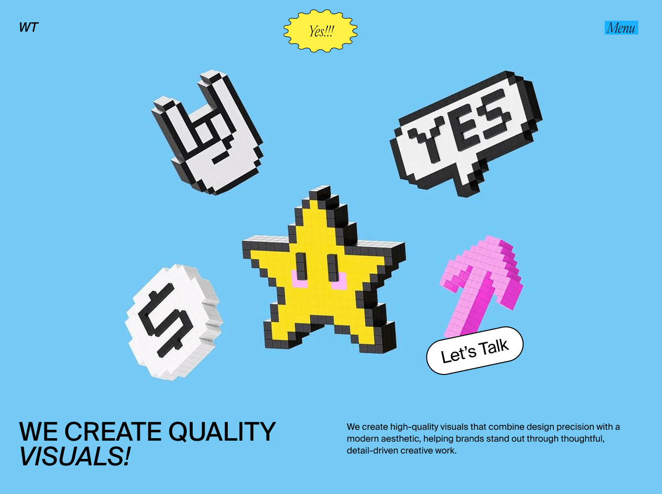
Designers are bringing back the early internet aesthetic - pixel icons, playful gradients, and nostalgic web elements - but with cleaner, more intentional layouts. This revival mixes early-digital energy with modern precision, turning familiar symbols from the 2000s into fresh, vibrant design moments.
It’s a trend fueled by nostalgia and optimism, showing up in landing pages, apps, and visual identities that embrace color, fun, and simplicity. Think of it as a wink to the past - now reimagined with today’s design clarity.
6. Interactive WebGL Objects
Interactive 3d elements are becoming more common as browsers get faster and designers push for unique digital experiences. With WebGL, interfaces can feature rotating cubes, spheres, or abstract shapes that respond to user input. These playful touches make a site instantly memorable and give it a sense of depth beyond flat design. While not every product needs such complexity, agencies, campaigns, and creative portfolios are increasingly using WebGL to showcase innovation.
7. Cinematic UI Previews
UI is no longer presented as static screens - motion is becoming central to how interfaces are designed and shown. In 2026, we see a rise in cinematic previews that highlight transitions, animations, and flows rather than flat layouts. Whether inside apps or on landing pages, moving presentations help users understand how an interface feels in action. Platforms like Awwwards or Savee are full of sites using full-screen video or looping device scenes to showcase UI through motion.
8. Abstract 3d Backgrounds & Motion Shapes
Interfaces are moving beyond flat colors and simple gradients - abstract 3d forms are becoming part of the visual language. Animated shapes in glass, metal, or soft materials create depth and mood, often used in hero sections or as subtle motion in the background. This trend adds sophistication while keeping the UI itself clean and functional.
9. Bold visuals and anti-design
Minimalism has been the safe bet for a long time, but it’s not the only option anymore. Bold colors, strong contrasts, and “unfinished” looks are making their way back into mainstream UI.
Anti-design doesn’t mean chaos - it means character. It’s about letting interfaces breathe with energy and imperfection, which can make them feel more human. Expect to see more playful, expressive layouts breaking away from the sterile grid.
Wrap-Up
If there’s one thing that ties all these trends together, it’s movement. UI in 2026 feels more alive - it reacts, it shifts, it responds. Scrolling tells a story, motion adds rhythm, and tiny details make screens feel a little more human. It’s less about rules and more about how design behaves in real life.
At Wannathis, we try to bring that same feeling into what we make - mockups that don’t just show design but help you feel it. Because that’s really where UI is heading now: lighter, more fluid, and a bit more connected to the people using it.


