


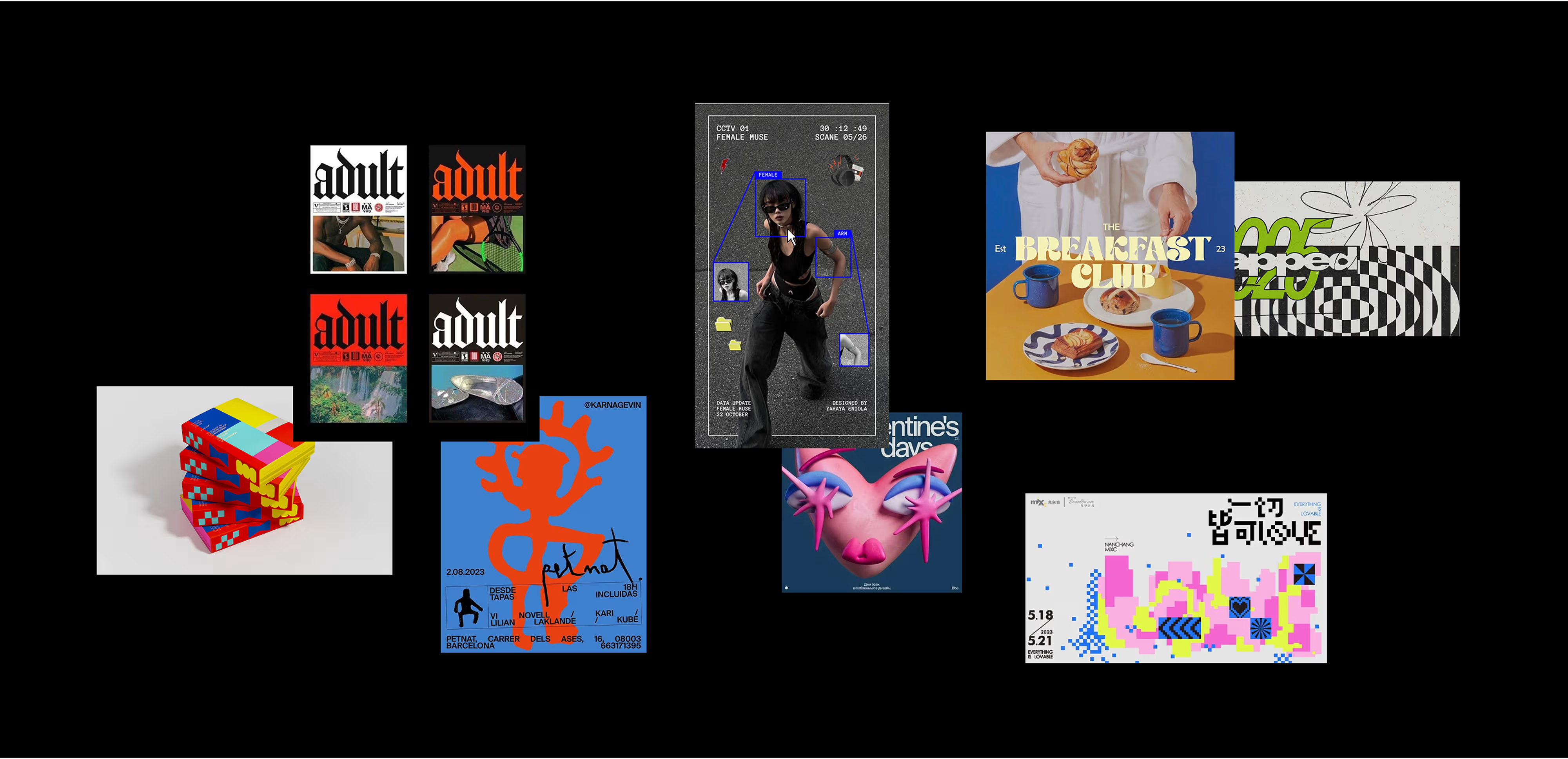
Graphic design trends 2026
Graphic design in 2026 feels a lot more alive. You can see designers moving toward work that has personality, small imperfections, texture, and even a bit of attitude. The polished, super-controlled look isn’t going anywhere, but it’s definitely no longer the only standard. Upcoming year is much more about trying things, mixing old and new, playing with interaction and letting visuals feel a little more human again.
With all of that happening, this trends feel especially lively. They’re less about following a rulebook and more about finding ways to make your work feel honest, expressive and fun to look at. Here are nine directions that capture this new creative rythmn.
1. Naive Design
Naive design keeps getting more and more attention because it makes everything feel personal. The lines are loose, the shapes are simple, and the overall look is intentionally imperfect. It brings a kind of honesty you don’t get from overly polished compositions. Lifestyle brands, small studios and even bigger companies are exploring it for its warmth and friendly character.
It’s that feeling of “this was made by a human, not a machine,” and people love that right now.

2. Experimental Typography
Typography is getting a lot more playful this year. Designers stretch letters, bend proportions, mix styles and move away from those predictable, “safe” type choices everyone used for so long. The goal isn’t to create the perfect font pairing anymore, it’s to create emotion.
Sometimes the letters look a bit odd or slightly off-balance, but that tiny bit of weirdness is exactly what makes the design feel alive. And if you’re curious about how type is evolving in general, we took a closer look at the typography trends in our article Top Typography Trends 2026 for Designers. It’s a deeper dive into where lettering is heading and why designers are experimenting so much right now.

3. Neo-Medieval Gothic Expression
This trend taps into old-world visual drama but in a new, stylish way. Think gothic lettering, dark romantic textures, illuminated manuscript vibes and rich, heavy contrast, but all reinterpreted through a modern lens.
It’s moody, expressive and a little theatrical. Designers use it to add depth and attitude without going fully into fantasy aesthetics. It feels fresh because it blends historical references with contemporary clarity.

4. Playful Commercial Nostalgia
Designers are leaning into nostalgia, but with a wink. Instead of recreating the past exactly, they borrow its warmth and charm and mix it with cleaner, more modern visuals. Think retro packaging styles, early-2000s energy, soft gradients, glossy highlights or pop-ish colors.
It’s familiar without being outdated. It makes people smile because it reminds them of something they once loved, but now reimagined for today.

5. Humanized Expressionism, Intentional Imperfection
This trend celebrates the messy, expressive side of design. Rough textures, hand-drawn marks, uneven strokes, scribbles and spontaneous shapes all play a part. Instead of cleaning everything up, designers leave in the quirks on purpose.
It’s a reaction to the overly sterile, ultra-perfect digital aesthetics we’ve seen for years. People want sincerity, and this style brings it front and center.

6. Neo-Modernist Color Blocking (Continuing trend)
Color blocking isn’t new, but the 2026 version is much bolder and more curated. Designers pair unexpected color combinations, use oversized blocks of color and create layouts built almost entirely around contrast and balance.
It’s confident, clean and visually striking. And even though it’s minimal in structure, the colors themselves carry a lot of personality.

7. Everything 3d
3D is everywhere right now, and it's becoming one of the most recognizable visual languages of the year. Designers use soft rounded shapes, floating objects, glossy materials, textured surfaces and sculptural forms to add depth and richness to their work. Even a single 3D element can make a layout feel more dimensional and more polished.
What’s interesting is how natural 3D has become in everyday design. It doesn’t feel gimmicky anymore. It’s more like a new baseline for creating visuals that feel fuller, more tactile and more satisfying to look at. Whether it’s in product mockups, brand worlds or simple decorative elements, 3D brings a sense of presence that flat graphics can’t always match.

8. Pixelated Modernism
Pixel-inspired design is making a comeback, not as a full retro style, but as a modern graphic vocabulary. Designers use chunky pixels, bitmap textures and simplified shapes, often mixing them with high-resolution imagery.
It creates a fun contrast between the digital past and the digital present. It’s playful, graphic and instantly recognizable.

9. Post-Digital Symbolism
As design gets more complex, there’s a growing interest in simple symbolic shapes that feel timeless but also slightly futuristic. Designers use signs, icons, runes and abstract forms to communicate concepts quickly without relying on heavy text.
It’s clean and minimal, but still expressive. These symbols act almost like a visual shorthand for emotions and ideas, which makes them perfect for fast-moving digital content.

Wrap-Up
All nine trends have one thing in common. They make design feel more human again. Whether it’s a raw texture, a nostalgic color palette or a bold experimental letterform, the goal is the same — to bring personality back into visual work. And even a small shift toward these ideas can change how a project feels, making it warmer, more expressive and a lot more fun to explore.
What’s especially nice about this new wave of design is that it opens the door to more honest storytelling. Designers are mixing old influences with new tools, leaning into craft, playing with symbols and rebuilding the emotional side of digital visuals. There’s a sense of freedom in the air, and it shows in the work.


