Color Trends 2026 for Designers and Brands
If you look at how color has been evolving over the last few years, one thing becomes very clear: trends are getting quieter, deeper, and more meaningful. Color in 2026 isn’t just about what looks good on a moodboard - it’s about what makes people feel grounded, restored, curious, or energized.
And while Pantone hasn’t announced their Color of the Year yet (they usually drop it in December), the direction is already visible. Interior forecasts, fashion shifts, and early design reports all point toward palettes that feel warmer, more natural, more emotional, and a lot more intentional.
So we pulled together the key color trends for 2026 that designers and brands should actually pay attention to. Not just because they’re trendy, but because they make sense.

1. Earthy & Grounding Colors
Earthy, grounding colors are becoming a major direction for 2026. Think terracotta, clay, muted rust, warm ochre - shades that feel like they’re pulled straight from natural materials. These tones bring stability and warmth, and they fit the growing desire for design that feels human rather than hyper-polished.
For brands, these colors create instant closeness. Even without texture, they read as tactile and honest, which is why so many identities are moving toward them. It’s not just a trend, it’s a shift in how designers think about color: less noise, more meaning, more emotion.
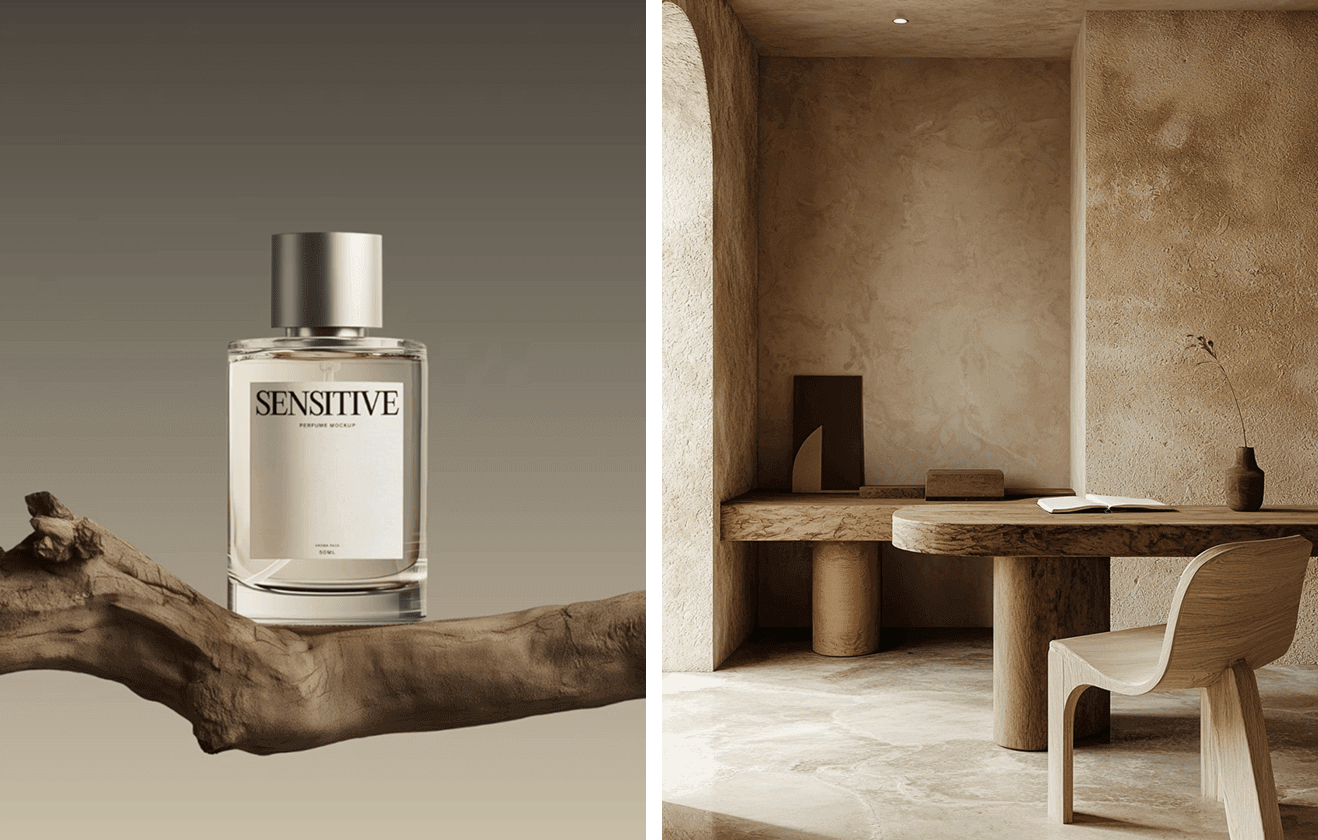
Perfume Bottle Mockup on Wooden Branch and Wooden interior
2. Intense & Vibrant colors
Alongside all the grounding tones, there’s a completely different color story happening - a wave of vibrant, expressive shades that feel fresh, modern, and full of movement. Electric Fuchsia, Blue Aura, Amber Haze, Jelly Mint, and, of course, Transformative Teal (which is the Color of the Year by WGSN) all bring a sense of optimism and gentle forward-shift. These colors feel alive, but still controlled enough to work in thoughtful, contemporary branding.
They create a clear contrast to the earthy palette, and that contrast itself is becoming one of the biggest themes for 2026 - the balance between calm and energy, warmth and brightness, stability and change.

Nike concept and Gradient sphere by Carsten Gueth
3. Warm Neutrals That Feel Soft
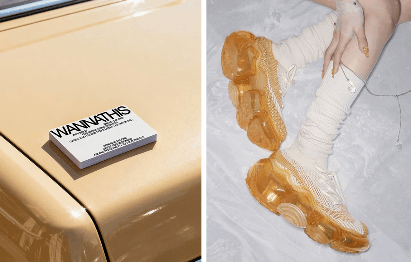
Warm sand, khaki, clay, biscuit tones - neutrals are warming up in 2026. They’ve moved away from the cool greys and sharp whites that used to dominate minimalism. These shades feel more inviting and real.
They’re perfect for brands that want a natural, honest presence without relying on bold color. Beauty, packaging, editorial - warm neutrals make everything feel softer and more grounded.
4. Greens With Calm Energy
Greens aren’t going anywhere, but they’re shifting into more subtle, refined shades. Sage, moss, eucalyptus, soft olive - colors that feel like they’ve been sun-softened.
These greens bring clarity and calm, which is why designers use them in wellness, lifestyle, sustainable products, or anything that relies on trust and balance. They say “grounded” without saying “eco brand.”
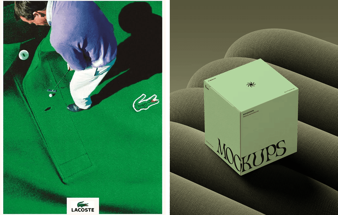
5. Deep Blue Jewel Tones
Jewel-like tones are coming back, but in a very toned-down way this year. And the one that’s getting the most attention is blue - especially the deeper, more refined versions of it. Instead of bright or electric blues, designers are leaning into muted sapphire, softened prussian blue, and those slightly dusty jewel shades that feel rich without being overwhelming.
They're great for accents - special packaging, hero elements in a layout, secondary brand colors. They add personality without overwhelming the overall identity.
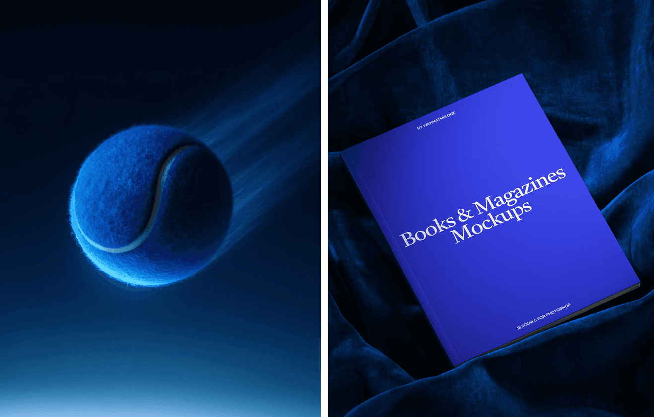
6. Browns Are the New Comfort Colors
Browns - from espresso and walnut to deep charcoal-brown, are showing up everywhere. They feel warm, confident, and strangely modern when used right. Paired with softer neutrals, brown instantly adds a grounded, premium feel.
It’s a great alternative to black when you want contrast without harshness.
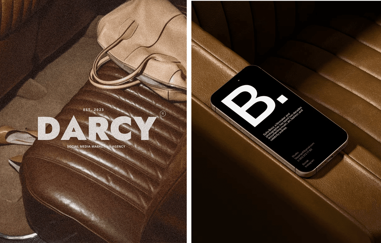
Darcy agency and iPhone mockup on leather sofa
7. Soft-Tech Pastels - The Digital Calm Trend
One of the softer shifts for 2026 is the rise of pastel tones that look a little dreamy, a little futuristic, and surprisingly digital. These misty lavenders, soft mauves, washed pinks, and bluish purples feel like they’re floating somewhere between nature and tech - calm enough for wellness brands, but also polished enough for interfaces and modern tools.
There’s a growing wave of what some designers call “soft surrealism,” especially in beauty, editorial work, and even AI-driven visuals. These palettes create that slightly romantic, slightly whimsical mood without slipping into anything sugary. They make digital design feel more human, more tactile, and less like a strict grid.
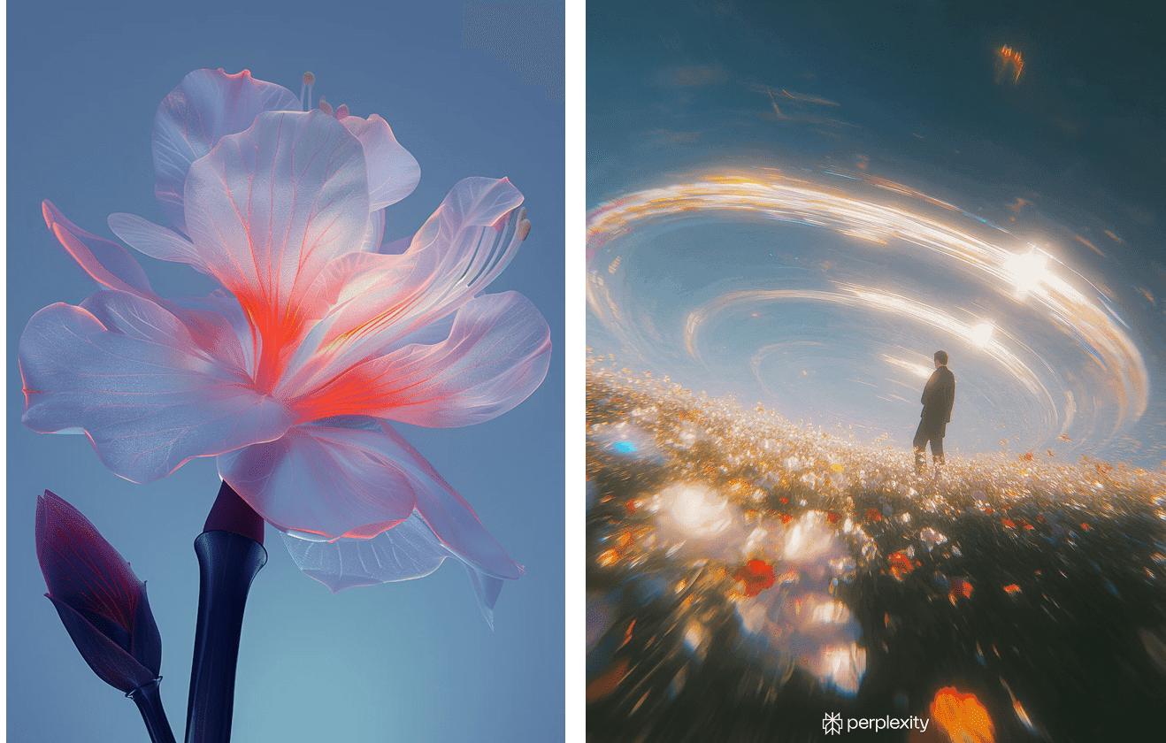
Futuristic flower and Perplexity visuals
Wrap-Up
What ties all these trends together is intention. Designers are choosing colors not just because they look trendy, but because they support the feeling a brand wants to create. Earthy tones add grounding and warmth. Vibrant shades bring energy and a sense of forward movement. Warm neutrals soften everything and make identities feel more human. Dusty jewel tones add quiet depth. Browns give a sense of comfort and confidence. And soft-tech pastels bring that calm, slightly dreamy digital mood that’s becoming more common in modern design.
Color in 2026 is less about being loud and more about being thoughtful - choosing shades that feel right, that carry meaning, and that support the story a brand is trying to tell.
And if you want to explore how these palettes behave inside real packaging, identities, or product scenes, you can always check out our mockups. We update them regularly, so there’s usually something new to spark ideas.


